
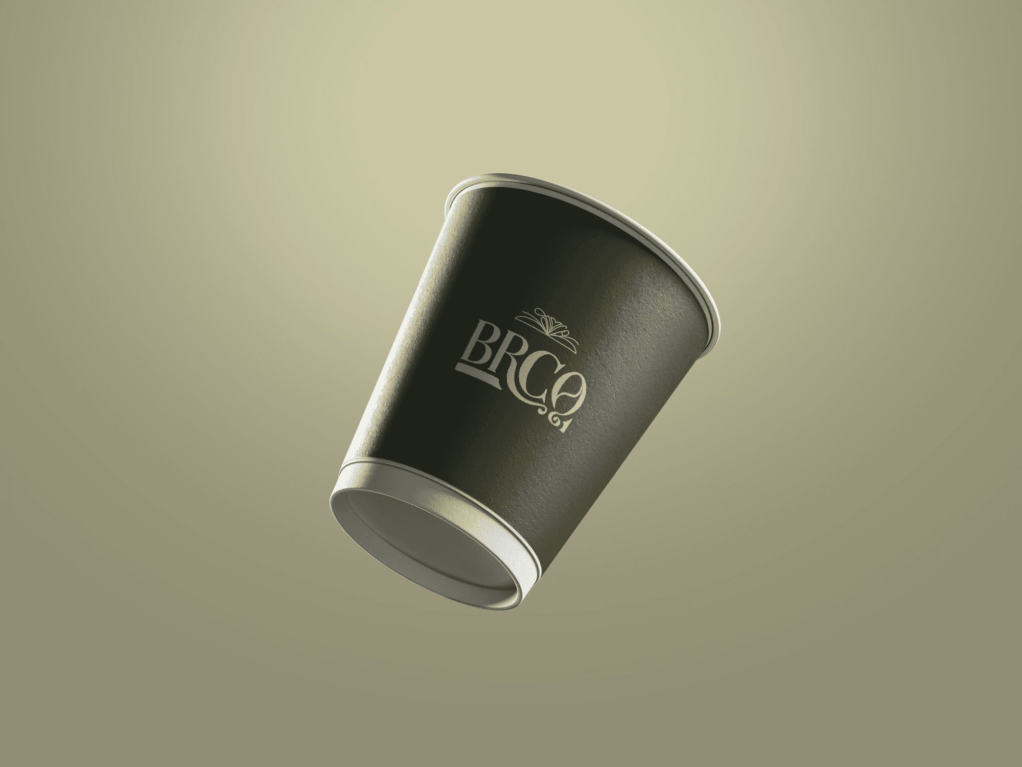
BRCO
BRCO
Logo creation & iIlustration
Logo creation & iIlustration

Design Direction.
The design direction draws from the bold character of Filipino barako coffee, combining vintage typography with handcrafted details. Warm, earthy tones and textured forms evoke familiarity, tradition, and the ritual of everyday brewing. The result is a visual identity that feels strong yet inviting, balancing heritage with a modern artisanal sensibility.

Initial logo exploration.
This stage documents the typographic decision making behind the BRCO mark. Multiple letterform treatments were tested to study weight, rhythm, and ornament, focusing on how the curves and terminals could express personality while remaining legible.
This stage documents the typographic decision making behind the BRCO mark. Multiple letterform treatments were tested to study weight, rhythm, and ornament, focusing on how the curves and terminals could express personality while remaining legible.

Color variations.
These color applications evaluate how the logo behaves across different tonal environments. Each palette was tested for contrast, reproduction, and emotional impact, helping define a system that remains recognizable while flexible. The chosen range supports consistent branding across packaging, signage, and merchandise.
These color applications evaluate how the logo behaves across different tonal environments. Each palette was tested for contrast, reproduction, and emotional impact, helping define a system that remains recognizable while flexible. The chosen range supports consistent branding across packaging, signage, and merchandise.

Brand illustrations.
The illustration set builds a secondary visual layer that extends the identity beyond the logo. Each icon was drawn to echo the same tactile quality as the typography, creating cohesion across the brand system. These assets function as modular elements that can adapt to marketing materials, packaging, and storytelling moments.


Kyppuccino™
All rights reserved 2026.